All rights reserved. No part of this newsletter may be reproduced in any form or by any electronic or mechanical means, including information storage and retrieval systems, without permission from the author. No excerpts, illustrations or any portion of this newsletter may be used as reference for workshops, seminars, or demonstrations without written permission of the author.
MAKE IT YOURS
Copyright 2025
Several years ago I read an article in a national art magazine that was written by a noted colored pencil artist. In it she described her creative process in detail. To summarize, she began by setting up a still life and began experimenting with lighting. She took numerous photographs and entered them into her computer software program. She manipulated the photos until she was satisfied with the composition and colors. Then she printed the photo and traced the outlines onto her drawing surface. Using her computer screen as her reference, she copied the screen image precisely onto her drawing paper.
My initial reaction was and remains… why? Why turn that image into a colored pencil drawing? Photography and colored pencils are two distinctly different mediums. What is being gained by copying one medium into another? After creating a photograph of a still life, why not enter it in a photo contest? Filling in the outlines of a photograph with colored pencil seems redundant. It is simply creating a coloring book deviod of the quirks and unique personal decisions that make colored pencil come alive. Additionally, in a recent colored pencil magazine, an artist posted the reference photo beside the colored pencil rendition. They looked the same. Again, I wondered, what is the point? Where is the interpretation, the creativity, the evidence of an artist’s eye? We all use referene photographs. We rely on them to help us to capture a memory. But we should know when to divorce ourselves from the photo and concentrate on our skills and the possibilities before us.
Now, you may say that even some of the Old Masters used aids like grids and the camera obscura to create their art. True, but they were also trained in drawing and incorporated their vast experience while using these aids. They did not rely on another’s work; they used these tools to augment their established drawing skills.
I understand that for some, art is a business, and accuracy and speed are paramount to maintain an income. So, replicating personal photographs or those available on the internet and tracing them is a necessary evil. But this approach has its drawbacks. Often, the idiosyncracies of camera lenses and aperture settings find their way into drawings and make them easily recognizable as mere copies of photographs.
For me, that recognition degrades the work. Some will disagree with me. However, I want to look at the art and not be distracted by how the camera sees. I don’t want to sift through distorted shapes and infinite detail caused by wide angle lenses or bokeh reflections due to open apertures on telephoto lenses. Instead, I want to see the artist’s hand, the unique marks and color choices that reflect the artist’s skills and experience. I want to see the personality of the artist in the work. Approaching a piece, I want to be startled and excited by the artist’s vision, and encouraged to linger and marvel at its uniqueness. Art is supposed to be about individual expression, not about how effectively someone can color in little shapes.
Below is a reference photograph I used for a drawing I titled “Annisquam Light”. First, I did a study in graphite to explore values and composition. Then, I interpreted the scene in colored pencil, with an obvious emphasis on clouds. Had I merely copied the photograph, my work would have been no different than the phone image sent to me in an email. Instead, I used the reference photo only as a launching point and trusted my instincts and vision to render the scene with an artist’s eye.


So, my entreaty to you is this. Once you have found that image that speaks to you, do you have to trace it precisely? Does every shape in that photograph need to be included in the composition of your drawing? Do the colors really have to match? Are there elements in the image that you can render freehand to slowly wean yourself from a dependency on the photograph? Are there decisions you make that will mark the drawing as yours, rather than a product of a camera, a software program or a tracing box?
And, ultimately, are you willing to accept those minor flaws and idiosyncracies that will make the drawing uniquely yours? We all want to win contests and garner awards and elicit praise for our work. But photographic perfection should not be the goal. We should want to be brave enough to expose ourselves through our interpretations of reality. That is the purpose of art, to create something that no one else can. Yes, it is uncomfortable taking risks, but we will never discover our artistic vision by allowing our tools to dictate how we view the world. Override that impulse to copy. Explore. Enjoy the process. Have the courage to make it yours.
A ROAD NOT TAKEN
Copyright 2024
Want to improve your colored pencil skills? Then, try these two strategies that have worked for me. First, choose a subject you have not attempted. Just as we need to occasionally take a break from our daily activities to refresh ourselves, planning a respite from a favorite subject can foster surprising results. For example, over the years I have been fortunate to have illustrated examples of colonial architecture and people of that period. I enjoy the research and the challenge of bringing the past to life. But I do not focus on those subjects exclusively. I’ve found that if I create only historical scenes, my style and thinking become stagnant and routine.

Therefore, I will purposely switch gears and will draw a portrait or a still life or a landscape as a break and to immerse myself in different techniques. In that way, I can approach the next historical scene with fresh eyes and new skills gleaned from a totally different visual challenge.
Second, although I enjoy working with colored pencils, I do not use them exclusively. I like to jump from graphite to pen-and-ink and painting with acrylics as a vacation from creating images with colored pencil. My pattern is to to switch from one medium to another because I have found that the techniques required of one often enhance understanding and skill improvement in another.


For example, I often do sketches in graphite, and I revel in its complexity. It sets the stage for all other media because principles learned in graphite are universal. Color, by comparison, is easy because we have preconceived notions of what different colors represent. A blue horizontal band above a green horizontal immediately evokes an elementary landscape. The same two bands in monochromatic graphite, however, do not have the same effect. Therefore, working in graphite requires a heightened awareness of values, textures and volume that color can mask. A monochromatic drawing is a valuable reminder of the foundational nature of the medium.

Similarly, pen-and-ink emphasizes line more dramatically than graphite. When I draw with an ink pen, I concentrate specifically on line quality and contours. Contours define form, and varied thicknesses of line can indicate spatial depth. With ink I focus more on creating patterns to define the differences between textures and strokes that define atmospheric perspective. Making outlines disappear and making edges more natural become more important with ink. Ultimately, I’ve discovered that ink techniques translate into how I define shapes, values and textures with colored pencils.

Switching to acrylics on canvas enables me to create pure patches of color and quick, impressionistic strokes. Painting with acrylics pushes me away from the canvas and forces me to use my arm instead of my wrist, thereby creating a more loose application. My colored pencil pieces tend to be very tight and detailed, so painting with a brush reminds me that I can be loose with pencils also.

When I design a colored pencil piece, I remember the lessons learned in graphite and apply them. I also consciously think about contour lines and textures that are so important in my pen-and-ink work. And I reflect on the color changes I can achieve with blending paint and layering on canvas when I’m manipulating hues in a colored pencil drawing. In this way, each medium contributes information that helps me improve my work in colored pencils.
In addition to changing subjects and media, over the years I have enrolled in a variety of classes, workshops and seminars. I’ve taken classes in fashion design, which taught me the importance of textures; magazine illustration, which emphasized clear messaging and economy of space; sculpture, which stressed spatial design; photography, which highlighted composition; comic book illustration, which introduced story-telling; film study, which integrated multiple disciplines; and a wealth of art history classes, which assembled a global continuum of inspirational art. Even working summers for a contractor taught me how houses are constructed and enabled me to create architectural renderings of historic homes and create conceptual drawings of proposed buildings from blueprints. All of these varied experiences have contributed to and influenced how my hand now moves over the page. Sometimes, changing direction offers us a unique perspective, and taking a step back or a step away provides an impetus to leap forward.
So, be bold for the moment and draw subjects other than your usual preference. Push your skills into solving new and demanding visual problems. Draw a subject that is out of your comfort zone. Work with a pen or graphite or paint. Sculpt something. Design a mixed-media piece. Thumb through an art history book or view art available on the internet. Play with an unfamiliar medium and revel in the newness of it all. Time away from your pencils is not wasted. Think of it as an opportunity to learn something new and recharge. Yes, different media pose different challenges, but they all are related and involve communicating an idea to an audience. Ultimately, the broader your skill set, the easier it becomes to solve new visual problems.
If you take my advice, the changes in your colored pencil work will not be immediately apparent. But trust me, over time there will be a transference, a crossover, an expansion of your horizon that will help you grow. To paraphrase the words of poet Robert Frost, dare to take a less traveled road. It just may make all the difference.
…End…
LANDMARK DECISIONS
Copyright 2024
Making art involves making decisions. Choices about what to include or exclude or what to highlight and to interpret become more critical when the subject is a well-known landmark. For example, the Wayside Inn Grist Mill is a national historic site located in Sudbury,

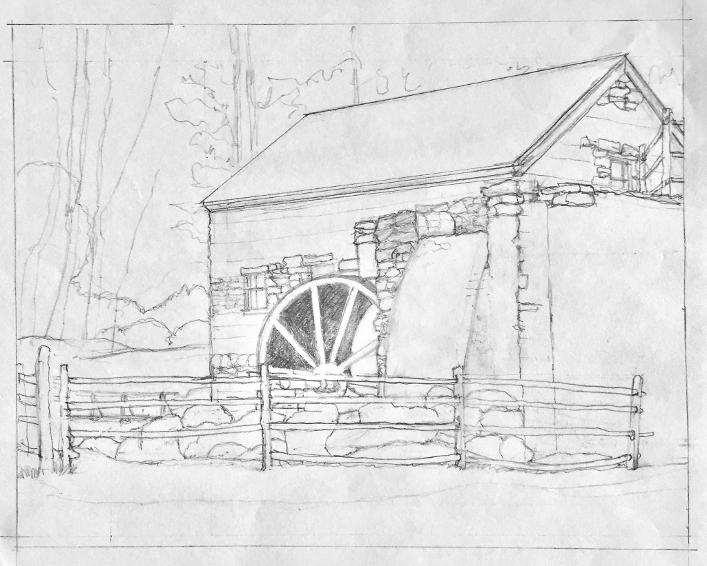
I began with a pencil sketch to establish a composition. I worked from my own photograph and chose a slightly different angle than the collection of existing images I had researched. After transferring the line drawing, I filled the composition with base colors. I like to cover the surface to evaluate how colors will work together before I commit to darker values. I concentrated on the water wheel initially. It is the focal point because of its dominant color and because it defines the purpose of the building. All the other values and textures, I decided, would be subordinate to the contrasts in the wheel.


Next, I focused on the walls. The rocks were an interesting challenge because of their random placement. Unlike tiers of bricks or uniform blocks, rocks of different sizes and shapes were located throughout the facades. I could not rely on lines of perspective to achieve a sense of depth. Instead, I softened outlines and muted the varied rock colors to create the illusion.


The rock sluice that redirects the water is very dark in the reference photograph due to dampness, mold and shadows. When I tried to replicate that effect, the individual rocks tended to disappear into a dark mass. So, I lightened the sluice walls to make the individual boulders visible; I added warm colors to the gable end of the building for contrast; and I further softened the rock details on the long wall to separate them from the sluice wall. Since the rock placement is a unique quality of the mill and its waterfall, I wanted the viewer to easily explore the construction.

Similarly, I lightened the dark fence and the boulders that line the pool at the base of the waterfall to make them both readable. I minimized grass details in the foreground and avoided shingle marks on the roof because I was concerned about distracting the viewer with too many details. I also wrestled artistically with the background foliage. When I included the dark trees in the scene, my attention was directed both upward and to the left away from the building. Therefore, I opted to soften the pines beyond the mill to a suggestion and eliminate the trees visible on the left. I added warm tones to the sky and vague autumnal colors in the left background to create an illusion of morning fog. Hopefully, these purposeful departures from the landscape will heighten the viewer’s attention to a most fascinating structure.
Having finished a standard view of the mill, I decided to draw it from a different vantage point. I had climbed the hill behind the building and discovered the lake and canal that fed the waterfall. I photographed the mill from this angle, and this would become the resource for my second attempt. Like the previous drawing, I simplified the background trees on the right and eliminated the pines in the distant left landscape. I also eliminated the thick ground foliage in the left foreground and the overhanging branches that intruded from the upper left. I once again saved the details for the building and and its reflection on the water. With the gable end of the mill as the focal point, the trees, the embankments and the canal became simple abstract patterns that moved the eye through the composition.
This drawing was a departure from my highly detailed work, and I liked the result. But a viewer who had no knowledge of the mill site and its surroundings would not recognize the building as the famous landmark. Therefore, I decided create one more view and present them as a group. That way, this uphill view, as one of three drawings, would have a context.
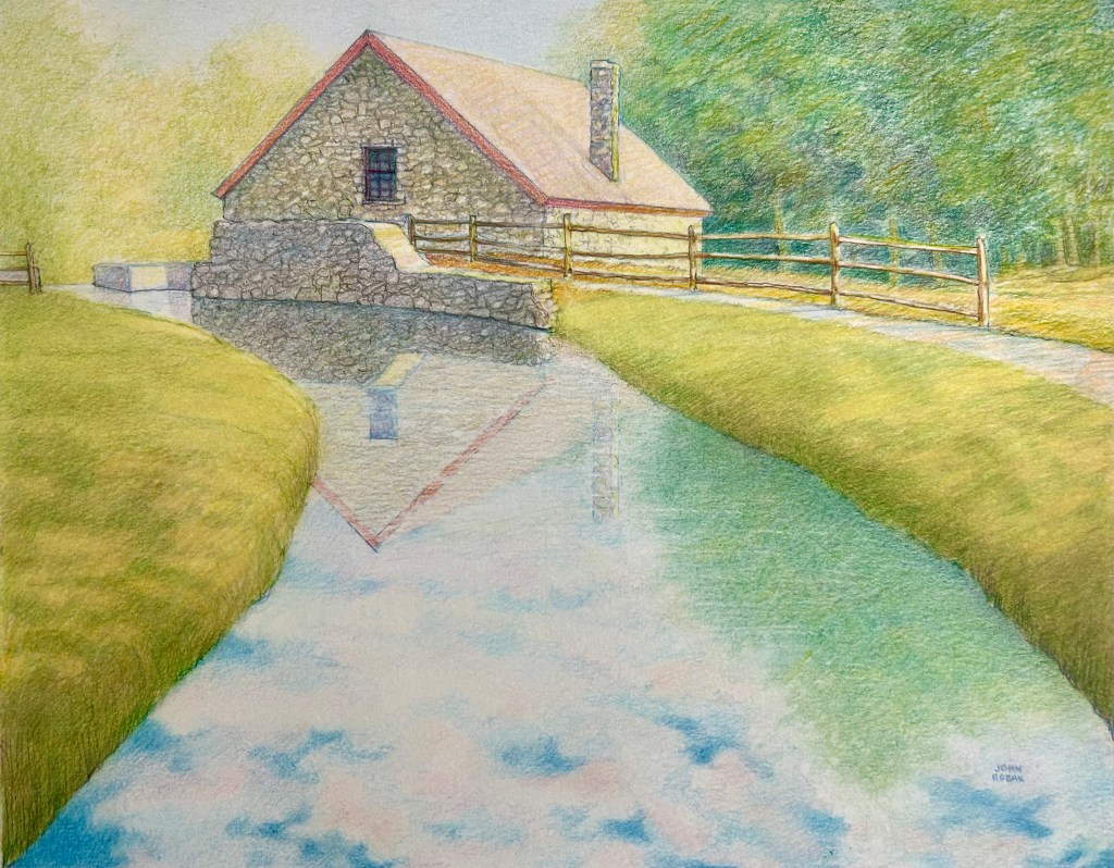
My third drawing presents the mill as seen from the access road. From this angle, the unique details of the New England rock facade and the characteristic wheel and the waterfall are visible. The stream that was hidden in the first drawing is explained, and the doors convey more information about this vital community resource. Interestingly, the mill is still in active use.
In this rendition of the mill, I combine increased foreground detail with a muted background to avoid visual clutter. Again, I want the viewer to drawn into the scene by the perspective of the road and stream and remain in the middle ground. I decided that including the dense stand of barren pines beyond the mill would be a distraction and lessen the visual impact of the tree along the embankment. In addition, this vantage point exposes the red of the water wheel and the similar red doors and eaves moulding. These intense warm colors contrast with the cool tones of the rock facade, the stream and the soft shadows on the dirt road. These contrasts make this third drawing more dramatic.
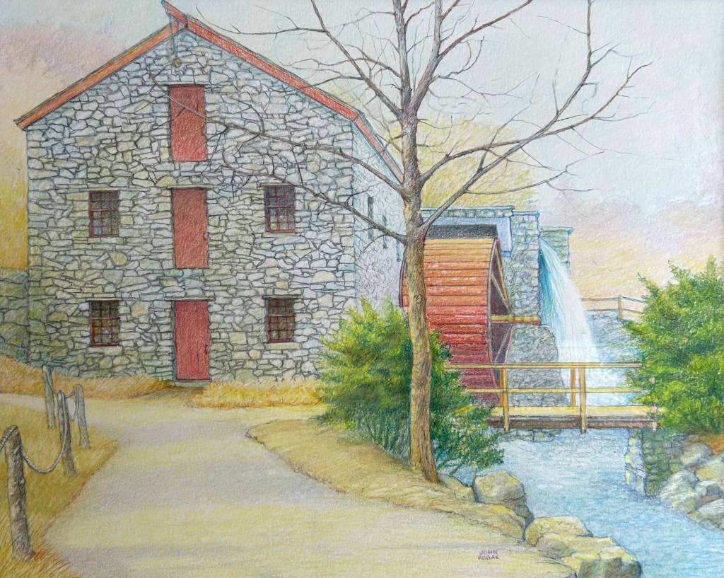
In conclusion, deciding what to include or to exclude in the landscape surrounding a familiar landmark can be challenging. In my drawings of the Sudbury grist mill, my goal was to highlight the unique rock construction that has caused so many artists, historians and tourists to visit and record this structure. I wanted to lead the viewers to the building by the clearest path possible and provide enough details to make them linger. Therefore, I opted to follow my instincts and depart from the reference photographs.
Sometimes we, as artists, have to alter reality in order to guide the viewer to what motivated us to pick up a pencil. In drawing landmarks, we naturally seek to be accurate in our depiction. But we also have to satisfy our artistic visions and offer to the viewer a unique interpretation of that which may be all too familiar.
…..End…..
COMPOSITION MAKES IDEAS COME ALIVE
Copyright 2021
Before I begin a drawing, I pose several questions. Why am I creating this image? What am I attempting to say? And how can I lead the viewer to a clear understanding of my intent? The answer invariably focuses on composition. Similar to a writer’s outline, an architect’s blueprint or a musician’s sheet music, composition provides a plan that directs the viewer through the visual rectangle. Composition, therefore, helps make the artists’ vision come alive.
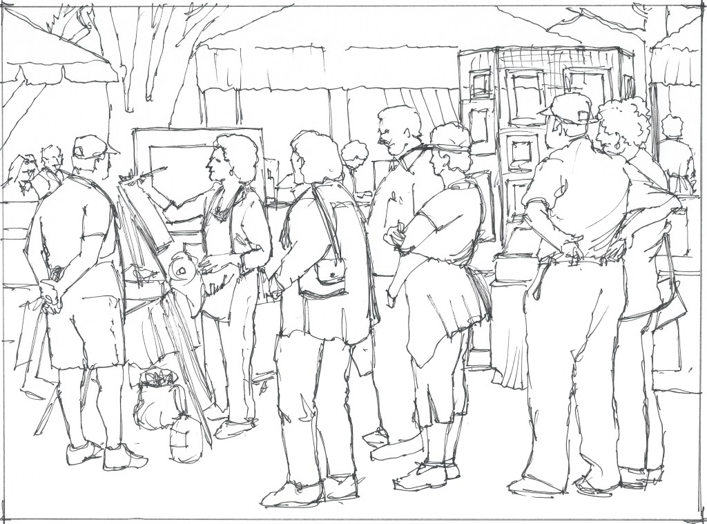
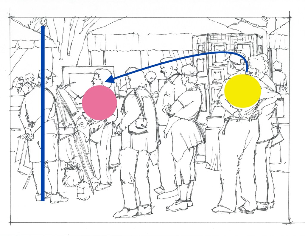
For example, at a local craft fair I saw an artist who was so focused on her work, she ignored the visitors who had gathered around her. She epitomized the dedicated artist. Despite the crowd, she was alone with her paints and absorbed by the creative process. The onlookers were also fascinated by the image taking shape on her easel. The mutual attention to the image seemed to unify the artist and the observers. It was this silent interaction that prompted me to design a composition I would eventually title “Portrait of an Artist”. I began with a sketch based loosely on reference photos of fair visitors. My goal was to structure the space to recreate my experience and hopefully lead the viewer to a similar revelation. I wanted to invite the viewer into the scene by first noticing the bystanders and then following the composition to the artist.

I drew the artist left of center at her easel, following the Rule of Thirds. The Rule of Thirds is a compositional rule of thumb that emphasizes placing the focal point away from the center of the visual rectangle. It assumes that in most compositions symmetry is static and that an off-center balance is more pleasing to the eye. The Rule of Thirds offers a simple formula. Divide the visual rectangle into three equal segments vertically and horizontally. Place the focal point of the composition at one of the intersections so that the horizon line or the focal point will not be in the center. Rather, the point of interest will be located at one of the intersections to create an asymmetrical design.
I filled the remainder of the frame with onlookers, and I placed the tallest figures on the right and decreased their sizes to lead the eye leftward.To return the eye into the composition, I placed another observer, the man with his hands clasped behind him. I placed the background tree as a subtle visual stop. I added a couple in the background left to return the eye into the rectangle. Between the figures, I suggested displays, tables, a grove of trees, and the tents common at outdoor art fairs. All of these elements were designed to move the eye to the artist.

Additionally, I isolated the artist’s profile in a large framed painting behind her to emphasize her narrowed concentration on the visual rectangle. I also planned to detail her features in contrast to the generic features of the fair goers. I wanted to show the artist in sharper focus than the rest of society.

Because of all the verticals in the scene, the tent roofs were a logical way to add dramatic horizontals to the design to prevent the eye from drifting upward out of the composition. The two tent segments at the left and right (A and B) help to pull the eye inward from the edges of the frame. The horizontal top edge of the frame behind the artist grounds her as well. Last, since the action is primarily in the foreground, I included small figures and foliage to suggest a larger physical space.

With the composition established, I transferred my thumbnail sketch to a heavy drawing paper and added color. I clothed the man on the right in an intense yellow because I wanted the viewer’s eye to go to him first. The display behind him would identify the location, and then the eye would naturally follow the figures to the left. I chose a red shirt and white pants and apron for the artist because I wanted her to have the highest contrast. The white is echoed in her supplies and the table coverings, unifying her with her art. I muted the colors of the remaining figures to contrast with the artist.
The man in the yellow shirt and the artist in the red are the two dominant colors in the scene. The eye naturally moves between them, although they are on opposite sides of the visual rectangle. My intent was to establish a relationship between the artist and the observer. Their color similarities bridge the visual space that separates them.
Those who make art often see the world differently than those who do not. And those who observe the artist at work often marvel at the magic that appears on the easel. But despite their differing perspectives and their locations in the scene, the artist and observers are linked. They both are held captive by the process of making a blank space come alive.
The completed colored pencil piece is 16” x 20” and drawn in Prismacolor pencils on Bristol Vellum. “Portrait of an Artist” relies heavily on the compositional elements that enable the viewer to decipher and share my experience. Composition, like the writer’s outline, is the foundation of successful communication.

…End…
A DIFFERENT KIND OF ART LESSON
Copyright 2022
I learned a valuable lesson years ago. It involved a print shop, two young men and a local newspaper. First, some background information.
In the early 80’s I was teaching and augmenting my income with occasional freelance work. One commission was particularly interesting and challenging. A Boston restauranteur wanted conceptual drawings of a restaurant he was converting in a New Hampshire resort area, and his project manager hired me. We sat in the gutted structure, and I drew what the owner wanted in the interior, a bar in one corner, a staircase to a lower level in another. Whatever he imagined, I drew. From these sketches, the contractor would design blueprints. This project led to a series of similar commissions in Dover, New Hampshire.
One project required me to create exterior drawings from blueprints of proposed buildings so that the developer could present his vision to banks and investors. While on my way to deliver the illustration of a condominium exterior, I stopped at a print shop on Central Avenue in Dover to have a copy made for my portfolio.
The shop was tucked into a block dominated by a camera store, a used furniture store and a Chinese restaurant. When I entered, the owner advised me that he was not finished with the print job for the two young men who leaned against the counter, and it would take a while. My project was due that afternoon, so I had no choice but to wait. As we stood listening to the sound of the press, we chatted. They had eyed my drawing and I explained its purpose, and the taller of the two eagerly showed me what they were having printed.
It was a comic book in black and white, and I thumbed through it, nodding approvingly. But I inwardly dismissed it because of its bizarre title, ridiculous characters that populated each frame and the outlandish concept.
“Very nice. Interesting,” I offered, while assessing the creators as art students having fun or hobbyists possibly creating something to share with friends.
“Here’s our card,” he said.
“Mirage Studios,” I read aloud.
“Yeah,” he smiled. “Our studio is a mirage. We work in our living room in our apartment a few blocks down.”
I smiled back.
“We’re going to try and sell this to a distributor.”
“Interesting.”
I checked my watch.
Finally, the printer delivered their copies and then attended to my order.
“Well, good luck,” I said, as they left. I was polite, but not sincere. My highly detailed architectural renderings were superior to the superheroes in their comic book, and I was being paid handsomely by some influential clients who promised more work. Besides, I reasoned, comics were not fine art or important commissions, and I was running late. I stuffed their business card in my pocket.
About a year and a half later I was visiting my father in western Massachusetts. While leafing through a local newspaper one morning, I spied an employment ad that was unusual for the area. It was an advertisement seeking talented people to train and work as staff artists.
As I read further I realized that the names in the ad, Eastman and Laird, were the same names I had read on the card the two young men had given me in the Dover print shop. They now were looking to populate a large facility with staff artists to illustrate their characters, Leonardo, Raphael, Donatello, and Michelangelo, the heroes of their now successful comic book, “Teenage Mutant Ninja Turtles”.
…End…
